
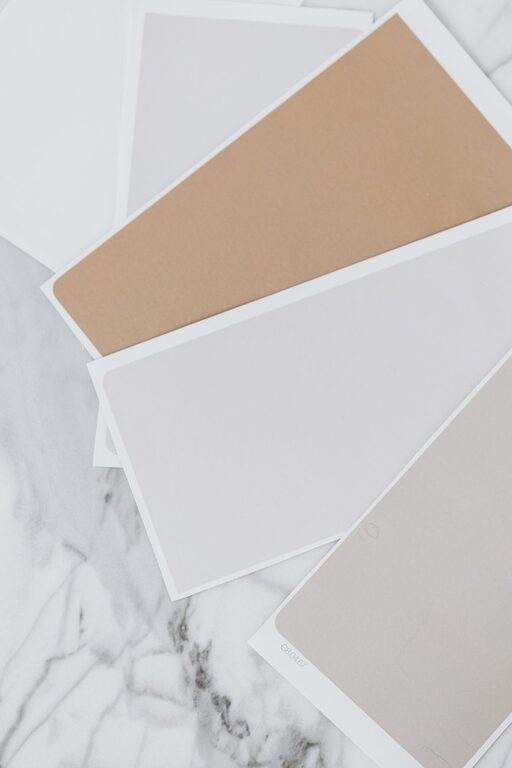
Creating a peaceful and relaxing environment at home often starts with the colors you choose. Calm colors can help reduce stress, promote tranquility, and make your living spaces more inviting. But with so many shades and tones available, how do you pick the right calm colors for your home? In this post, we will explore helpful tips and ideas to guide you through selecting colors that promote serenity and comfort.
Why Choose Calm Colors?
Colors have a significant impact on our mood and well-being. Calm colors tend to be soft, muted, and gentle on the eyes. They help create spaces where you can unwind after a busy day or enjoy quiet moments with family. Whether you want a restful bedroom, a peaceful living room, or a soothing bathroom, calm colors are an excellent choice to establish that atmosphere.
Understanding Calm Colors
Before choosing specific shades, it’s useful to know what makes a color “calm.” Generally, calm colors include:
– Cool tones: Such as soft blues, gentle greens, and pale lavenders. These colors often evoke feelings of peace and relaxation.
– Neutral shades: Like light grays, cream, beige, and soft taupe. Neutrals create a balanced, calming backdrop.
– Muted pastels: Soft pinks, dusty blues, and light mossy greens, which add subtle color without overwhelming the senses.
Tips for Choosing Calm Colors
1. Consider the Room’s Purpose
Think about how you use each room. Bedrooms benefit from soft blues or gentle lavenders because these colors encourage rest. Living rooms and dining areas might be best with warm neutrals or muted greens to foster connection and comfort. For bathrooms, pale blues or seafoam greens can create a spa-like atmosphere.
2. Test Colors in Different Lighting
Lighting affects how colors appear. Natural daylight, incandescent bulbs, and fluorescent lights can all change the look of your paint. Before committing, test paint samples on the walls and observe them at different times of day to see how they shift.
3. Start with a Neutral Base
Using a neutral color as your primary wall color provides a calm foundation. From there, introduce accent colors in furnishings, artwork, or décor items to add personality without overwhelming the senses.
4. Limit Bold Colors
While pops of bright colors can energize a space, limit them in calm rooms. If you want some vibrancy, use it sparingly—perhaps in a throw pillow, a vase, or a small rug—so the overall feel stays peaceful.
5. Use Matte or Satin Finishes
Glossy finishes reflect more light and can feel more intense. Matte or satin paint finishes diffuse light gently, enhancing the calming vibe.
6. Combine Colors Harmoniously
Choose colors that complement each other to keep the mood serene. For instance, pair muted blues with soft greens, or light gray with creamy beige. Using a color wheel can help you find harmonious combinations, such as analogous colors (colors next to each other on the wheel) that naturally blend well.
7. Incorporate Natural Elements
Colors inspired by nature—like soft greens, sky blues, and earthy taupes—help create a tranquil environment. Using natural materials alongside these colors, such as wood, stone, or woven textiles, enhances the calming effect.
Popular Calm Color Options
Here are some tried-and-true calm colors that work well in most homes:
Soft Blue
Blue is often associated with the sky and water, both calming sights. Light blue walls bring a fresh and airy feel without overwhelming the space.
Sage Green
A muted, grayish green reminiscent of leaves and moss, sage green adds subtle color that feels grounded and peaceful.
Warm Beige
Beige offers warmth and coziness. It pairs well with almost any accent color and provides a neutral, calming backdrop.
Pale Lavender
Lavender is a gentle color that adds a touch of elegance and softness without being too bold.
Light Gray
Soft gray tones are versatile and sophisticated. They create a serene environment that works with both modern and traditional décor.
Creating a Color Plan for Your Home
To ensure a cohesive look, plan how your calm colors flow from room to room:
– Pick one main color for large areas.
– Select complementary colors for smaller spaces or accents.
– Use textures and patterns in these colors to add depth and interest without compromising calmness.
– Keep transitions smooth by repeating colors or tones in adjacent rooms.
Final Thoughts
Choosing calm colors for your home is a wonderful way to cultivate a sense of peace and relaxation. Remember to consider the function of each room, test colors under different lighting, and combine shades that work well together. By thoughtfully selecting your color palette, you can turn your home into a sanctuary where you feel refreshed and comfortable every day.
—
We hope these tips help you in selecting the perfect calm colors for your home. Happy decorating!